flowchart LR
  A["Input Layer (One Hot)"]
  A --> B["Embedding Layer"]
  B --> C["Sum/Average Layer"]
  C --> D["Output Layer"]
Embeddings
Revisiting what we know
Embeddings …
- transform text into numerical vectors
- are used in neural network architectures
- Key benefit: Capture semantic similarities and relationships between words
- Already seen: Bag of Words
- Issue: These embeddings do not compress!
What are embeddings?
- Represent words and text as dense, numerical vectors
- Capture rich semantic information
- Context-aware, based on surrounding text
- Capture subtle semantic relationships
- Compact representation compared to simple techniques such as bag of words
Approaches to generate embeddings:
- Word2Vec, GloVe, FastText
- Train neural network to predict surrounding words
- CBOW or skip-gram architectures
- Learns semantic relationships in continuous vector space
- Transformer architectures like GPT
- Word embeddings provided by OpenAI
What does it look like?
Train a model to:
- predict the target word based on the (surrounding) context words, or
- predict the context words given a target word
Use of the model
Throw away the parts after the embedding layer!
flowchart LR
  A["Input Layer (One Hot)"]
  A --> B["Embedding Layer"]
Matching with embeddings
Task: Find the matching document for a prompt
TrueGet the OpenAI client
Get the embeddings
Compute the similarity
import numpy as np

def cosine_similarity(vec1: np.array, vec2: np.array) -> float:
    return np.dot(vec1, vec2) / ( np.linalg.norm(vec1) * np.linalg.norm(vec2) )


for text, text_embedding in zip(texts, text_embeddings):
    similarity = cosine_similarity(text_embedding, prompt_embedding)
    print(f"{text}: {round(similarity, 2)}")
This is the first document.: 0.89
This document is the second document.: 0.65
And this is the third one.: 0.33Visualization and clustering
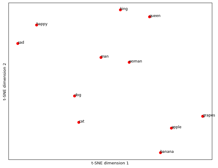
Define some words to visualize
Apply T-SNE to the embedding vectors
import numpy as np
import matplotlib.pyplot as plt

from sklearn.manifold import TSNE

# Apply t-SNE dimensionality reduction
tsne = TSNE(
    n_components=2,
    random_state=42,
    perplexity=5 # see documentation to set this correctly
)
embeddings_2d = tsne.fit_transform(np.array(embeddings))

# Plot the embeddings in a two-dimensional scatter plot
plt.figure(figsize=(9, 7))
for i, word in enumerate(words):
    x, y = embeddings_2d[i]
    plt.scatter(x, y, marker='o', color='red')
    plt.text(x, y, word, fontsize=9)

plt.xlabel("t-SNE dimension 1")
plt.ylabel("t-SNE dimension 2")
plt.grid(True)
plt.xticks([])
plt.yticks([])
plt.show()
Apply T-SNE to the embedding vectors
Cluster the embeddings
# do the clus#| tering
import numpy as np
from sklearn.cluster import KMeans

n_clusters = 5

# define the model
kmeans = KMeans(
  n_clusters=n_clusters,
  n_init="auto",
  random_state=1 # do this to get the same output
)

# fit the model to the data
kmeans.fit(np.array(embeddings))

# get the cluster labels
cluster_labels = kmeans.labels_
Visualize with T-SNE
import matplotlib.pyplot as plt

from sklearn.manifold import TSNE

# Apply t-SNE dimensionality reduction
tsne = TSNE(
  n_components=2,
  random_state=42,
  perplexity=5 # see documentation to set this correctly
)
embeddings_2d = tsne.fit_transform(np.array(embeddings))

# Define a color map for clusters
colors = plt.cm.viridis(np.linspace(0, 1, n_clusters))

# Plot the embeddings in a two-dimensional scatter plot
plt.figure(figsize=(9, 7))
for i, word in enumerate(words):
    x, y = embeddings_2d[i]
    cluster_label = cluster_labels[i]
    color = colors[cluster_label]
    plt.scatter(x, y, marker='o', color=color)
    plt.text(x, y, word, fontsize=9)

plt.xlabel("t-SNE dimension 1")
plt.ylabel("t-SNE dimension 2")
plt.grid(True)
plt.xticks([])
plt.yticks([])
plt.show()
Visualize with T-SNE
![]()
Seminar: LLM, SoSe 2025